Blog
-
Running the WordPress Plugin Directory Slurper

As part of my work on the WordPress Core Performance Team, I need to do analyses on the plugins in the WordPress Plugin Directory. For example, in WordPress 6.3 we’re finally shipping first-party support for adding async and defer to scripts (a 13-year old ticket). In this case, the excellent WordPress Directory Searcher (WPdirectory) is…
-
Comparing Markup with PHPUnit

For the upcoming WordPress 6.3 release, I’ve been contributing to the introduction of script loading strategies (i.e. the async and defer attributes). In the WP_Scripts class, all of the script tags are manually assembled with printf() & sprintf(), and as part of that work I wanted to start making use of helper functions that assemble…
-
Twitter Account Locked

Update: After more than three weeks, my account was unlocked. A few days ago, National Weather Service Portland tweeted: I replied: @NWSPortland Don’t forget graupel! BTW, I caught something frozen falling this afternoon in downtown. I also included a video of frozen precipitation bouncing off of a window ledge downtown. Now, if you don’t know:…
-
Sandboxing with Partytown

Partytown is a “library to help relocate resource intensive scripts into a web worker, and off of the main thread. Its goal is to help speed up sites by dedicating the main thread to your code, and offloading third-party scripts to a web worker.” Code running in a worker runs in a separate thread, ensuring…
-
Auto nvm use

I use nvm to manage my version of node which makes it easy to use the right version of node for specific projects. What has annoyed me with nvm is opening up a directory in terminal and running npm only to get: I’d have to remember to run nvm install after navigating to a project…
-
Sun Rising Behind Mount Hood: A 16-Year Journey
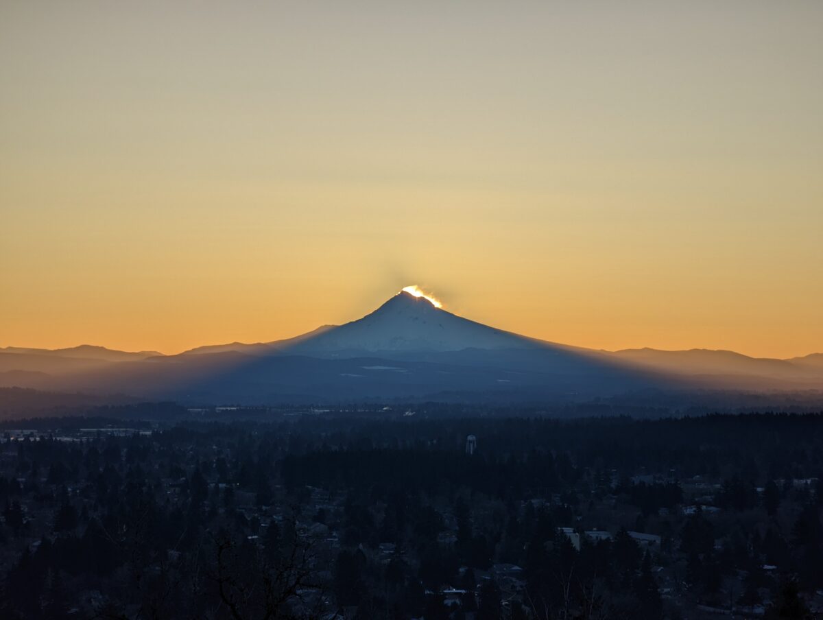
I used to go up to Rocky Butte often to watch the sunrise. One time I was up there and the sun rose very close to Mount Hood. That was February 11th, 2006. Ever since then I’ve wanted to try to capture the sun rising directly behind the mountain and to see the shadow that…
-
Unexpected Handling of Element IDs in PHP DOM

tl;dr: In PHP, make sure you remove the id attribute from a DOM element before you try to use the same id on another DOM element, even if the you already removed the first element from the document. This is not the case in browser DOM. I stumbled across something really bizarre in PHP’s document…
-
[Speaking Foreign Language]
![[Speaking Foreign Language]](https://weston.ruter.net/wp-content/uploads/2021/01/speaking-foreign-language-1200x675.jpg)
During the inauguration of President Joe Biden and Vice President Kamala Harris today, Jennifer Lopez performed “This Land Is Your Land”. I usually watch everything with closed captions turned on so I don’t miss anything, but if I didn’t speak Spanish the subtitles wouldn’t have helped. During her performance the subtitles included something truly ironic.…
-
History Advocates for Wearing Masks during a Pandemic
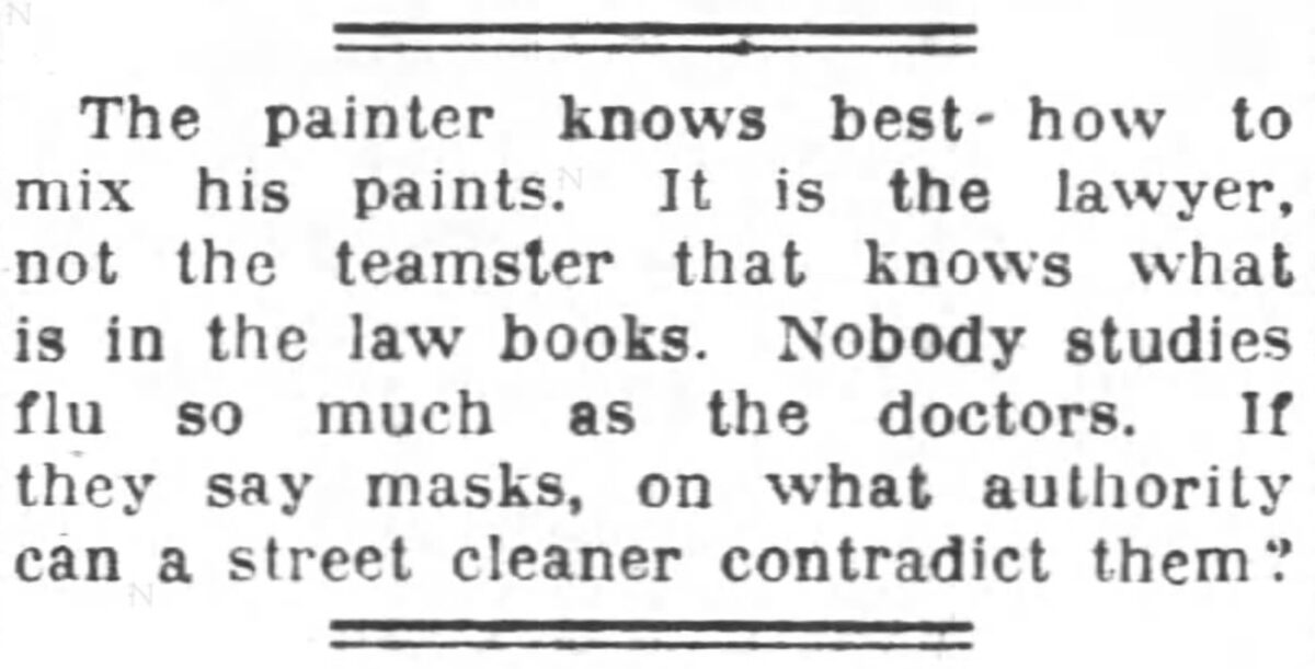
Twitter surfaced a tweet to me which had some newspaper clippings during the 1918 flu pandemic (aka “Spanish Flu”): The tweet didn’t cite the sources, but the clipping mentioning Portland jumped out at me since that’s my home. To find the source I googled for [“wearing masks in portland might save a life. it might…
-
Story: Running on Mount Tabor
I just published my first Web Story using the new Web Stories plugin, sharing some highlights of one of my favorite things to do: running on Mount Tabor. The images were taken on a Pixel 4 XL. The time-lapses were taken at 5x speed while I was walking. The Web Stories editor doesn’t yet have…